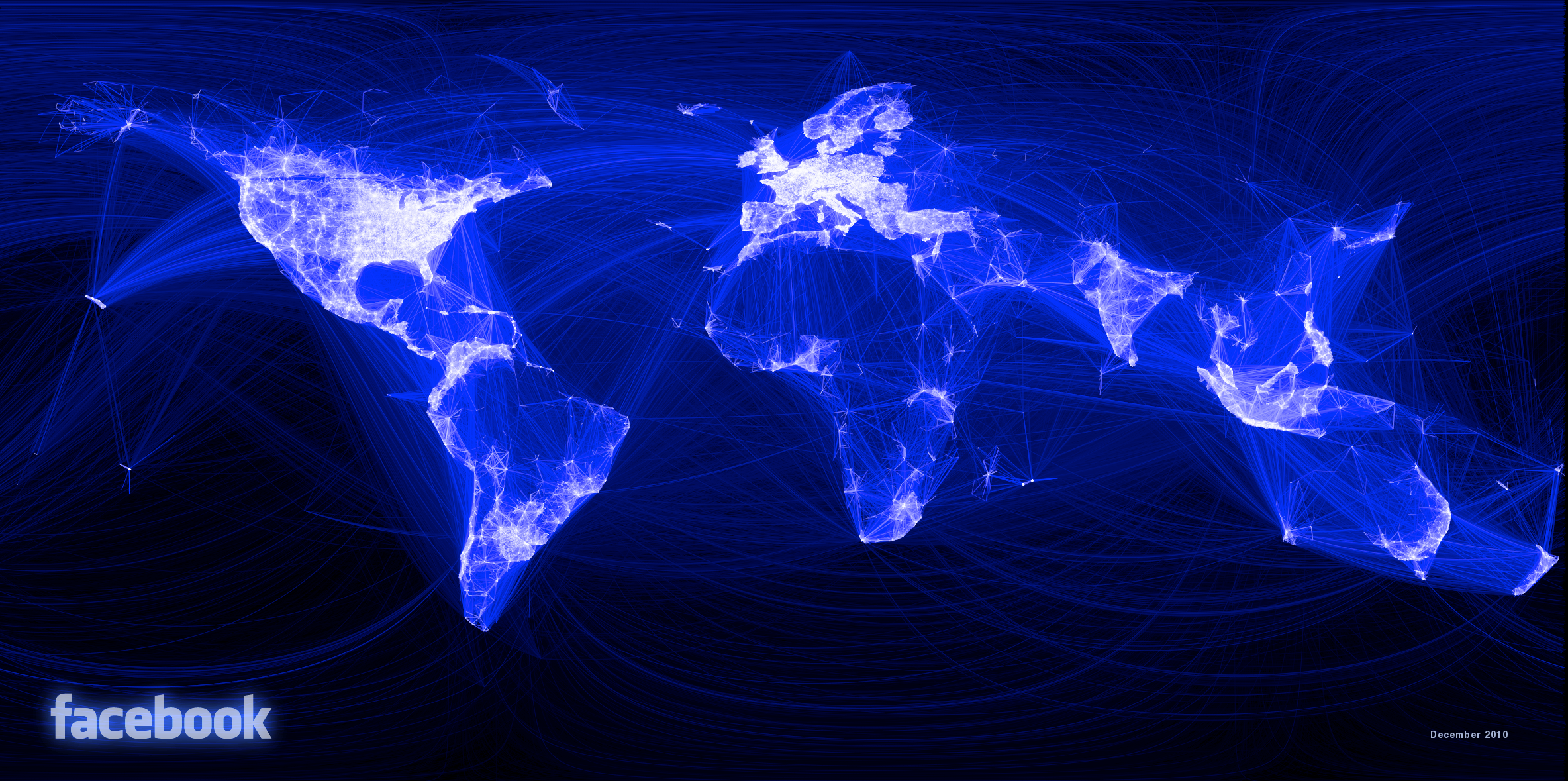
A facebook intern created a visualized view of friendship on facebook on a global level. The result is this impressive image, visualizing the friend-relations of more than 500 million facebook users. It is interesting how we are connected, but also where are the main gaps where facebook is not present at all. Well done.
Description of the project on Facebook:
Visualizing data is like photography. Instead of starting with a blank canvas, you manipulate the lens used to present the data from a certain angle.When the data is the social graph of 500 million people, there are a lot of lenses through which you can view it. One that piqued my curiosity was the locality of friendship. I was interested in seeing how geography and political borders affected where people lived relative to their friends. I wanted a visualization that would show which cities had a lot of friendships between them.
I began by taking a sample of about ten million pairs of friends from Apache Hive, our data warehouse. I combined that data with each user’s current city and summed the number of friends between each pair of cities. Then I merged the data with the longitude and latitude of each city.
….
Continue Reading..


